285 Utilization Point in Time Report
Overview
Utilization Source: SVLive wired data
This report is found on the Reports Dashboard.
Displays workpoint-level utilization trends over time by day for a specific floor.
Note that Report 285 focuses on Peak Workpoint figures and includes only Wired data (since Wi-Fi data cannot be tied to a specific workpoint).
Provides a high-level overview of trends in utilization data and allows you to validate highs and lows by drilling into specific days and hours.
Key Data
- A floorplan displays workpoint-level utilization for a specific 1-hour block of time.
- Gray desks are completely free.
- Light blue desks have a sleeping or inactive device connected.
- Dark blue desks are in active use.
- A timeline displays hourly utilization of the floor over the course of the entire day.
- The purple line shows the total number of workpoints on the floor.
- The lightest blue shows the total number of desks in use.
- The medium blue shows workpoints being used by active devices.
- The dark blue shows workpoints being used by sleeping or inactive devices.
- A bar chart displays daily utilization of the floor for the entire month (showing what % of workpoints were in use during the busiest hour of each day).
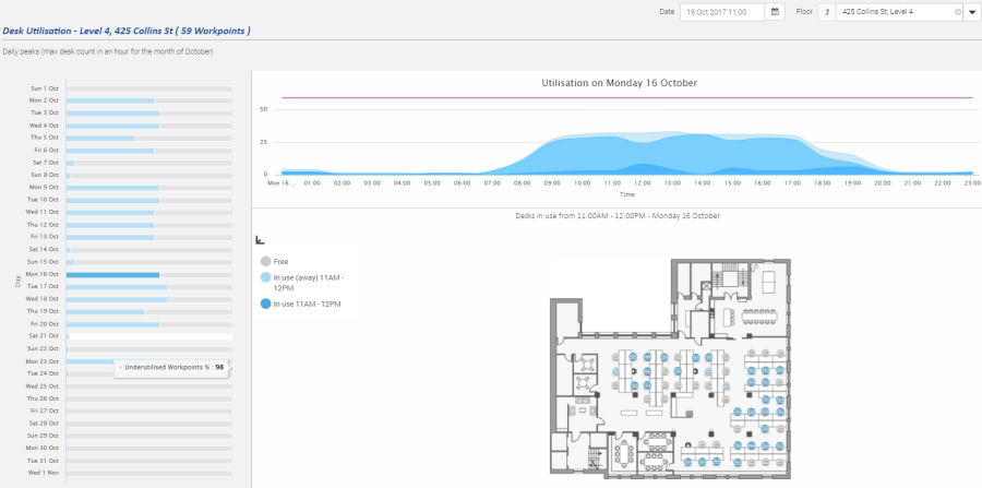
The timeline will default to a 24-hour view of the day. This can be altered to display only specific business hours.