Team Utilization Profile Dashboard
Purpose
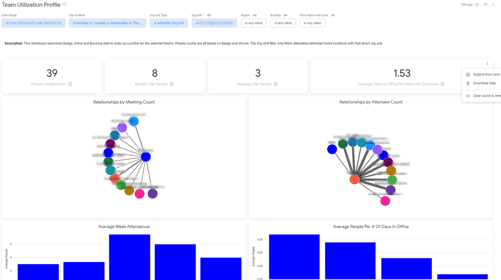
This dashboard is designed to show how teams interact with their workplace, by highlighting both their utilization and their synergies with other teams. This relationship is measured by both number of meetings with other org units, as well as number of attendees in those meetings. What days of the week these meetings occur and where (by seat count) are also highlighted. This helps Space Planners understand which teams should ideally be moved to or placed near other teams due to strong relationships.
Special Data Elements
- Relationships by Meeting/Attendee Count - These charts show what org units meet with the selected org unit. Thicker lines indicate more meetings/attendees and thus stronger relationships.
Special Filters
- Org Unit Type filter - This controls what the source org unit is for the dashboard. If you want to see how teams relate to each other based on staff home location org unit, use Attendee Home Location Org Unit. This is the org unit seen in the allocation data (i.e. the VBS). Instead, if you want to see relationships based on the imported (HR system) org unit, select Attendee Org Unit.
Limitations
- Person Assignments are based on the latest date in the Date Range selector. It is also always based on Home Location.