Badge Building Utilization Dashboard
Purpose
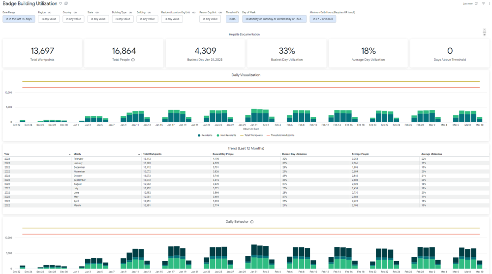
For Space Planners and Managers, this dashboard provides a visual summary of how their utilization data is tracking against workpoints, and a general overview of staff attendance behavior. Date range is selectable, though the Trend tile and the ‘last 90 days’ tiles ignore this filter and exist for quick comparison.
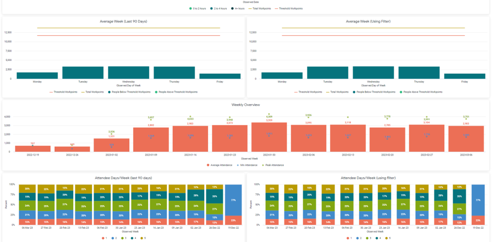
Each week in the date range (and last 90 days) is broken down by what % of the workforce is attending for that many number of days. For example, in the screenshot you can see that for most weeks, about 20% of the workforce is coming in for 2 days each week.
By default, this dashboard is filters to only badge entries with at least 2 hours of activity, or untracked activity.
Special Data Elements
- Total People - The count of assigned people. This stat is not derived from badge data.
- Busiest Day People - The highest count of people that appeared badged in that appeared on any single day.
- Busiest Day Utilization - The Busiest Day People divided by the total workpoints, displayed as %.
- Average Utilization - The average badged-in person count divided by the total workpoints, for the date range.
- Days Above Threshold - The count of days that had badged-in person counts above the threshold % multiplied by the total workpoints.
- Daily Utilization - Residents - The count of people who badged in and have a home location within the selection.
- Daily Utilization - Non-Residents - The count of people who badged in and do not have a home location within the selection.
- Average Week - People - The average count of people who badged in for each given day.
- Trend - Average People - The average number of people that badged in on each day within that month.
- Trend - Average Utilization - The average number of people that badged in on each day within that month divided by total workpoints.
- Trend - Busiest Day People - The highest count of people that badged in that appeared on any single day within that month.
- Trend - Busiest Day Utilization - The Busiest Day People of that month divided by the total workpoints, displayed as %.
- Attendee Days/Week - Displays, for each week, what % of staff come in for what number of days. Incomplete weeks will show skewed data. One tile will always show the last 90 days, while the other is controlled by the filter.
- Attendee Days/Month- Displays, for each Month, what % of staff come in for what number of days. Incomplete months will show skewed data. One tile will always show the last 90 days, while the other is controlled by the filter.
Special Filters
- Threshold filter - Controls the threshold bars and applies to the Days Above Threshold. Threshold bar is Threshold % multiplied by total workpoints.
- Minimum Daily Hours (Requires OR is null) - Filters the data set to just badge entries of this many hours OR with no hours tracked. You can edit this filter, but it is recommended to keep ‘OR is null’ so that workpoint metrics are correct and untracked hours records are included.