Mobile Solutions Templates
Mobile Framework
Mobile Solutions Templates
The Solutions Templates mobile app provides a series of simplified, cookbook-style examples for using each of the major features of the Archibus mobile framework. Use these templates to customize Archibus mobile apps, or develop your own.
Tap Solutions Templates in the Archibus mobile app to open the templates application. The menu below lists the types of templates available:

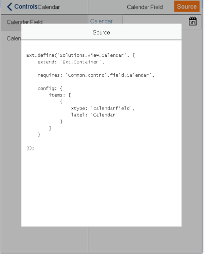
As you drill down in this menu, you open templates for sample views. When you arrive at a sample view, tap the view's Source button to display source code for the view. Source code for the Calendar view, for example, appears below:
Sections below describe samples you can open from the Solutions Templates mobile app.
Open the Solutions Templates mobile app to view samples in each category on your screen.
Note:
For users in security group
SYSTEM-MGR-MOB
, the Solutions Template app displays in the App Launcher with other Archibus mobile apps.
Controls
Templates for controls appear below. Sub-menus appear in parentheses:
- Prompt (Common Prompt, Configure Prompt, Hierarchical Prompts, Prompt Friendly Values, Multi-key Bar Code)
- Picker and Text Prompt
- Phone and Email Fields
- Progress Bar
- Signature Capture
- Camera (Camera Button, Document Field, Image in Form, View Selector)
- Bar Code
- Search with Bar Code
- Location
- Calendar (Calendar Field, Calendar)
- Select
- Time Picker
- Text Field
- Radio Field
- Check Field
- Multiple Field
Descriptions for selected control templates appear below.
Prompt > Common Prompt
Template demonstrates use of a predefined prompt field. Commonly used prompt fields are defined in the
Common/control/prompt
folder. Model reuse on
Common.control.prompt.Employee
in this example.
Prompt > Configure Prompt
Define new prompt fields and configure using the control
Common.control.field.Prompt
, illustrated in this template.
Prompt > Hierarchical Prompts
Prompt fields can have hierarchical relations. In this template, the Building Code field is defined as the parent of Floor Code and Room Code fields, and Floor Code is the parent field for Room Code. When a value for the parent field is selected, the child fields are restricted based on the parent’s value.
For the Room Code field, the parent fields are Building Code and Floor Code. For the Floor Code field, the parent field is Building Field. When a ,dadfadfavalue for a child field is selected, values for parent fields are set.
Prompt > Picker and Text Prompt
Template demonstrates use of controls
Common.control.field.TextArea
and
Common.control.button.Picker
. Tap the Picker button to open a pop-up list of values. Tap the field Description to open a pop-up text area, to insert and view long texts.
Progress Bar
Template demonstrates use of
Common.view.panel.ProgressBar
.
The first example displays, on button tap, a progress bar with default settings:
- initial value: 0
- max value: 100
- progress message: Loading Item {0} of {1}
On Cancel action, the progress bar window closes.
The second example displays, on button tap, a progress bar with custom settings:
- initial value: 1
- max value: 50
- progress message: Current item: {0} / {1}
The function
increment()
recursively increments the progress bar. The progress bar closes on
complete
or on
cancel
events.
Camera > Camera Button
Template demonstrates use of a toolbar camera button. It uses the control
Common.control.Camera
, which includes ability to take a picture, and display it in a pop-up window with Cancel and Attach buttons. Only the Cancel button is handled by the control. The user of the control implements the Attach button handler.
Camera > Document Field
Template shows the control
Common.control.field.Document
, as it displays a predefined image.
Camera > Image in Form
Template combines the
Common.control.Camera
and the
Common.control.field.Document
controls. You can take a picture, and on
attach
action, the image appears in the Document field.
Camera > View Selector
Template combines use of
Common.control.Camera
,
Common.view.navigation.ViewSelector
, and
Common.control.button.ViewSelection
. You can take a photo and attach it. When the photo is attached, a badge is displayed on the Documents button. To change the picture, attach a new one. Tap Documents to open a view that displays the photo attached. Tap Back to navigate back to the initial screen.
Location
If you have enabled GPS location on the device, you can display location properties supplied by the device or browser. Location properties vary from device to device. In the broadest sense, location refers to latitude and longitude readings. Devices that have location support can provide values for latitude and longitude.
A displayed value of Not Available indicates the device does not display location properties.
Drawings
Templates for drawings:
- Pan-Zoom
- Locate Assets
- Marker
- Placement
- Redlining
Descriptions for selected drawing templates appear below.
Pan Zoom
Template demonstrates use of control
Common.control.Drawing
using the floor plan for HQ 17, allocation plan type. Tap a room to display the room's Building Code, Floor Code, and Room Code, separated by commas.
Locate Assets
Template demonstrates how to locate a room on a floor plan, in this case Room 101 on Floor 17 of Building HQ. The example builds on the Drawings > Pan-Zoom example. The designated room is highlighted in red.
Maps
Templates for maps:
- Esri Map
- Esri Basemaps
- Show Building
- Show All Buildings
- Show Buildings By Use/Occupancy
- Show Current Location
- Locate Asset
- Marker Action
- Marker Click Event
- Way Finding
Use the Way Finding template to incorporate wayfinding capabilities in mobile applications. The template provides a solution to find the best path between one's current location, and a desired destination. An application with this capability can place a pin for each location on a map in the Archibus mobile app. The solution applies to distinct locations on a campus or in a neighborhood, not to locations within the same building.
Especially useful is to incorporate wayfinding capabilities in the Reservations portion of Workplace Services, or in the Maintenance application. In the first instance, meeting attendees can use Reservations to find their way to a scheduled meeting at a designated location. For service calls, craftspersons can use the Maintenance application to find directions to their next call.
Navigation
Templates for navigation:
- Navigation View
- List and Edit Views
- Icons
Descriptions for selected navigation templates appear below.
Navigation View
Template demonstrates use of
Common.view.navigation.NavigationView
and the use of
Common.controller.AppHomeController
.
NavigationView
works with
Common.view.navigation.NavigationBar
, which provides the toolbar. Buttons for Apps and Other appear in this example. Tap the Apps button to navigate back to the App Launcher.
List and Edit Views
The first screen displays a view that extends
Common.view.navigation.NavigationView
, which uses
Common.view.navigation.NavigationBar
to display the toolbar.
The view contains a list view that extends
Common.view.navigation.ListBase
. The navigation feature requires the existence of one controller, which extends
Common.controller.NavigationController
, and facilitates navigation from list view to edit view.
List view displays a list of employees. Tap a name to edit a record, or tap the Add (+) button to create a new employee.
Edit view extends
Common.view.navigation.EditBase
. This view uses all the components of the navigation feature.
Sync
Templates to synchronize mobile data with Web Central data:
- Download Validating Table
- Sync Transaction Table
- Partial Sync
- Single Record Sync
Each of these four menu items includes useful documentation for the associated function.
Descriptions for selected sync templates appear below.
Download Validating Table
Download a specific validating table with the
ValidatingTableStore#clearAndImportRecords
function. Tap Download in this template to execute.
The example uses the equipment standards store. To make the effect of the Download button clearer, tap Empty the Store to delete all records in the store and empty the list. The store is initially populated, since this app uses auto background data sync. Before the app executes a download, it makes a network check.
Sync Transaction Table
Template demonstrates the sync process for a transaction table, the
surveymob_sync
table that contains space survey records. During the sync process, the app performs these actions:
- Checks if the device has an active network connection and if the Web Central server is online.
-
Transfers data from the mobile device to the Web Central database, using the
SynchronizationManager.syncTransactionTablesfunction. - As a sample, template displays syntax to call a workflow rule (WFR), but does not call an actual WFR.
-
Transfers data from the Web Central database to the mobile device using the
SynchronizationManager.syncTransactionTablesfunction.
Validations
Templates to validate selected data:
- Validation
- Custom Validation
Descriptions for selected validation templates appear below.
Validation
Template demonstrates use of standard validations such as presence, length, exclusion and inclusion, as well as validations defined in
Common.data.Validations
, such as
minvalue
and
maxvalue
. On button tap, the mobile app verifies the following field values:
- Name field value must have more than two characters and should not be Admin or Operator .
- Age is a numeric, required field with values between 0 and 150.
- Gender field value must be Male or Female .
Custom Validation
Template demonstrates how to set up custom validations for models that extend
Common.data.Model
, and demonstrates how to validate a panel’s record. A custom validation is defined to validate two dependent fields: age and email. When the age value is greater than or equal to 16, the email field must have a value. Standard presence validations are used for name and age fields.