Define a simple chart
HTML Chart Control
Define a simple chart
Technologies > User Interface Add-Ins > HTML Chart Views > Line Chart
The following example demonstrates a line chart. The panel has
type="htmlChart"
with a specific
controlType
of
lineChart
. This simple chart contains a single grouping axis and a single data axis. The property id is assigned to the grouping axis. The book value is shown on the data axis.
The legend (at the bottom of the chart) instructs the user as to what color represents each type of data. In the below image, only one type of data (Book Value) is shown. When the user examines charts with multiple types of data, they can simplify the chart, if desired, by clicking on the legend entry for the data type that they wish to hide and show.
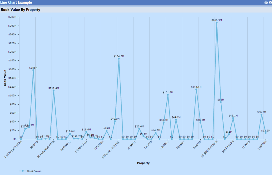
<view version="2.0"> <title translatable="true">Line Chart Example</title> <dataSource id="chartLine_ds"> <table name="property" /> <field table="property" name="pr_id" /> <field table="property" name="value_book" /> <sortField table="property" name="pr_id" /> </dataSource> <panel id="chartLine_chart" type="htmlChart" controlType="lineChart" dataSource="chartLine_ds" showLegendOnLoad="true" showLegendAsPopUp="false" legendLocation="bottom" showDataTips="true" backgroundColor="0xc6e2ff"> <title translatable="true">Book Value By Property</title> <groupingAxis dataSource="chartLine_ds" table="property" field="pr_id" showLabel="true" labelRotation="45"> <title translatable="true">Property</title> </groupingAxis> <dataAxis dataSource="chartLine_ds" table="property" field="value_book" showLabel="true"> <title translatable="true">Book Value</title> </dataAxis> </panel> </view>
Chart control types
A chart can easily be converted to a different format, such as a pie or line graph, by simply changing the value of the panel's
controlType
.
<panel id="chartCol_chart"
type="htmlchart"
controlType="pieChart"
...>
The following are available for
controlType
:
pieChart
(default)
lineChart
columnChart
barChart
stackedBarChart
stackedAreaChart
columnLineChart
barChart3D
stackedColumnChart
Note : Note that a chart's colors may vary when viewed on different browsers. For example, the colors of a pie chart when viewed in Chrome may appear darker than when viewed in other browsers. This is because Chrome uses a different saturation level.
Valid field types
The grouping axis may be of type String, Numeric, or DateTime. The data axis must be of type Numeric.