Customizing Colors of Archibus Workplace
Add-in Manager / Workplace
Customizing Colors of Archibus Workplace
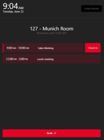
You may want to change the color scheme of Archibus Workplace to match your company branding. The below images show examples of custom color schemes.

Procedure
The color scheme is stored in the file
themes.js
, which is located at:
\schema\ab-products\essential\dev\workplace\src\styles\themes.js
Open
themes.js
and overwrite the default color hex values with your desired colors. Once you make changes, you need to
rebuild the Workplace app.
themes.js Settings for V.2023.04 and Later
You can set colors for the following components of Workplace:
| Color Use | Default Evo Color | Default Figma Color | Default Hex Color |
|---|---|---|---|
| Main body background |
getColor('background', 'background-main', theme) |
||
| Alternate background, active surface | getColor(‘background’,'background-variant',’theme’) | ||
| Surface/card backgrounds | getColor('background', 'surface-main', theme) | ||
| For the backgrounds of disabled states | getColor('background', 'disabled', theme) | ||
| Alternate Surface/Card backgrounds | getColor('background', 'surface-variant', theme) | ||
| Overlays of modals and alerts | getColor('background', 'overlay', theme) | ||
| My Workspace backgrounds | getColor('cornflower-blue', 'lighter', theme) | ||
| My Meetings backgrounds | getColor('salmon', 'lighter', theme) | ||
| My Workspace Booked for Others backgrounds | getColor('gold', 'lighter', theme) | ||
| Primary CTA, buttons, links, active states | getColor('brand', 'primary', theme) | ||
| Organization light logo background | getColor('brand', 'darkest', theme) | ||
| Text/content placed on the background | getColor('content', 'on-background', theme) | ||
| Secondary Text/content icons | getColor('content', 'on-surface', theme) |
,
Disabled states getColor('content', 'disabled', theme)
Dividers, mark boundaries, filed borders getColor('content', 'outline', theme)
For muted text getColor('content', 'muted', theme)
Informational alert getColor('status', 'informational', theme)
Success states, positive actions getColor('status', 'success', theme)
Warning states, progress markers getColor('status', 'warning', theme)
Error states, negative actions, danger getColor('status', 'critical', theme)
Text on dark background getColor('white', theme)
TODO Add description when available getColor('neutral-dark', 'base', theme)
TODO Add description when available getColor('neutral-light', 'darker', theme)
Background for visitor in Attendees list getColor('blue', 'lighter', theme)
Text for visitor badge in Attendees list getColor('blue', 'darker', theme)
Hover background color for menu item getMenuItemColor('hover', theme)
Pressed background color for menu item getMenuItemColor('pressed', theme)
Default background color for selected menu item getMenuItemColor('selected', 'default', theme)
Hover background color for selected menu item getMenuItemColor('selected', 'hover', theme)
Pressed background color for selected menu item getMenuItemColor('selected', 'pressed', theme)
For focusing on white elements and elements on a white background 0px 0px 0px 2px ${backgroundSurfaceMain}, 0px 0px 0px 4px ${brandPrimary}
Button/primary/default getButtonColor('primary', 'default', theme)
Button/primary/pressed getButtonColor('primary', 'pressed', theme)
Button/primary/hover getButtonColor('primary', 'hover', theme)
Button/primary/text getButtonColor('primary', 'text', theme)
button primary focus elevations['button-focus'](getButtonColor('primary', 'default', theme)).boxShadow
Button/secondary/pressed getButtonColor('secondary', 'pressed', theme)
Button/secondary/border getButtonColor('secondary', 'border', theme)
Button/secondary/hover getButtonColor('secondary', 'hover', theme)
Button/secondary/text getButtonColor('secondary', 'text', theme)
Button/borderless/pressed getButtonColor('borderless', 'pressed', theme)
Button/borderless/hover getButtonColor('borderless', 'hover', theme)
Button/borderless/text getButtonColor('borderless', 'text', theme)
Button/danger/border getButtonColor('danger', 'border', theme)
Button/danger/pressed getButtonColor('danger', 'pressed', theme)
Button/danger/text getButtonColor('danger', 'text', theme)
Button/danger/hover getButtonColor('danger', 'hover', theme)
button danger focus elevations['button-focus'](getButtonColor('danger', 'border', theme) ).boxShadow
Button/activated/default getButtonColor('activated', 'default', theme)
Tab/selected/content getTabColor('selected', 'content', theme)
Card/text/sub getCardColor('text', 'sub', theme)
elevation-`0`. No description of the usage. elevations['elevation-0'].boxShadow
elevation-`1`. Elements placed on the base surface, cards, buttons etc. elevations['elevation-1'].boxShadow
elevation-2. Hover states for surfaces, popovers, tooltips elevations['elevation-2'].boxShadow
Should only be used for the shadow of the header shadow/header 0px 5px 9px rgba(0, 0, 0, 0.25)
Should be used for the backgrounds in the calendar and right side user pane of ‘My Workspace’, ‘My Meetings’, and ‘Workspace Booked for Others’ as well as the cards on the dashboard shadow/Card 0px 4px 16px rgba(84, 96, 111, 0.18)
Shadow for buttons that use a brand blue color shadow/Brand 0px 0px 16px rgba(27, 75, 197, 0.2)
This shadow is exclusively for floating action buttons shadow/Fab 0px 10px 40px rgba(161, 161, 164, 0.3)
This shadow is exclusively for floating action buttons that use the brand blue shadows shadow/fabBrand 0px 1px 6px rgba(27, 75, 197, 0.24)
Should be used for all modal popups shadow/Modal -3px 0px 35px rgba(34, 34, 34, 0.16)
To be removed ui/Yellow #F8CA08
Hover background color for menu item
No longer used in application
No longer used in application
themes.js Settings for V.2023.03 and Previous
You can set colors for the following components of Workplace:
|
Variable Name |
Color Use |
Default Figma Color |
Default Hex Color |
|
nav1 |
Header, floor sidebar, hamburger slider menu |
Navigator/Charcoal 1 |
#282D41 |
|
nav2 |
Header button background |
Navigator/Charcoal 2 |
#1A1E2C |
|
uiBrand |
Brand color |
UI/Dodger Blue |
#3395FE |
|
uiWhite |
White |
UI/White |
#FFFFFF |
|
bg1 |
Body background |
Background/Grey 1 |
#EFF0F4 |
|
bg2 |
Form field background |
Background/Grey 2 |
#F3F5FB |
|
bgHover |
Hover row background |
Background/Hover Blue |
#F3F9FF |
|
text3 |
Secondary text and secondary button background. |
Text/Grey 3 |
#A4A9B7 |
|
text4 |
Secondary text against dark background |
Text/Grey 4 |
#5F6886 |
|
text5 |
Primary text |
Text/Grey 5 |
#444444 |
|
textBrand |
Brand color when used as a font |
UI/Dodger Blue |
#3395FE |
|
textOnBrand |
Font color on brand background |
UI/White |
#FFFFFF |
Sample of
themes.js
, which is located at:
\schema\ab-products\essential\dev\workplace\src\styles\themes.js
export const defaultTheme = { /** * Header, floor sidebar, hamburger slider menu * Figma Color: Navigator/Charcoal 1 */ nav1: '#222222', /** * Header button background * Figma Color: Navigator/Charcoal 2 */ nav2: '#000000', /** * Brand color * Figma Color: UI/Dodger Blue */ uiBrand: '#FFBC00', /** * White * Figma Color: UI/White */ uiWhite: '#FFFFFF', /** * Body background * Figma Color: Background/Grey 1 */ bg1: '#F4F4F4', /** * Form field background * Figma Color: Background/Grey 2 */ bg2: '#FAFAFA', /** * Hover row background * Figma Color: Background/Hover Blue */ bgHover: '#FFFCF4', /** * Secondary text and secondary button background. * Figma Color: Text/Grey 3 */ text3: '#9C9B98', /** * Secondary text against dark background * Figma Color: Text/Grey 4 */ text4: '#676767', /** * Primary text * Figma Color: Text/Grey 5 #444444 */ text5: '#231F2C', /** * Brand color when used as a font * Figma Color: UI/Dodger Blue */ textBrand: '#FFBC00',