Grid Control 3.0 Overview
Grid Control 3.0
Grid Control 3.0 Overview
Grid Control 3.0 offers advanced features and improves performance over Grid Control 2.0. Use Grid Control 3.0 to take advantage of these capabilities:
- Load and paginate data rapidly.
- Present data in a contemporary interface.
- Filter date ranges, numeric ranges, and the like via a mini-console.
- Change column order.
- Group columns.
- Specify fixed columns.
Web Central's PM Planner (ab-pm-planner.axvw) and the Service Console (ab-request-console.axvw) views use this control.
Note: Select the grid control version that suits your needs when you design a grid. You cannot select features from both versions for the same view.
These topics explain how to use Grid Control 3.0:
- Initialize and Load Data
- Actions and Selections
- Data Visualization
- Grouped Columns
- Fixed Columns
- Group by Category
- Edit Grids and Grid Data
- Grid Control 3.0 API Reference
To use these features:
- Define a data source in the view file.
- Define an HTML panel in the view file.
- Add a JavaScript file to the view.
- Initialize the controI in the JS file.
See Add Grid Control to a View in Grid Control 3.0 API Reference , and refer to sample code in these files:
- http://localhost:8080/archibus/schema/ab-products/solutions/parts/grid/ab-ex-advanced-grid-categories.axvw
- http://localhost:8080/archibus/schema/ab-products/solutions/parts/grid/ab-ex-advanced-grid-categories.js
Data Columns
The grid displays data columns defined in JavaScript code, not all columns defined in the data source.
Formats and units for various data values follow Grid Control 2.0 conventions.
Group Columns
To group columns, specify in the view file that certain columns have a group title. See
columnGroupTitle
and
columnGroupId
column properties in
Grid Control 3.0 API Reference
.
The example below groups cost columns under Costs:

Change Column Order
Drag columns left or right to change their order. Reload the view to restore the original order.
If a column lies within a group, you can drag the column within the group, but not outside of it.
Group Records by Category
To group records by category, specify the default category in the view. You can also provide a view action to change a category. See
groupBy
property and
groupBy
method in
Grid Control 3.0 API Reference.
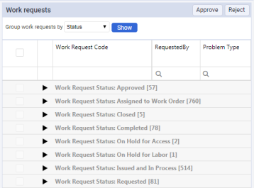
Each category header displays the number of records in that category.
By default, the grid expands all categories after the view loads. You can collapse categories, as above, or expand any category to display its list of records.
Page Control
You can force a grid to display records on multiple pages. See the pageSize property in Grid Control 3.0 API Reference . Page control appears below the list of records:

If the grid groups records by category, records within each category may span multiple pages. If you expand or collapse any category, the grid recalculates the number of visible records, and number of pages required to display them.
Totals and Sub-totals
To display totals for numeric fields, add the
showTotals
property to the data source field in the view. The grid displays total values in the totals row.
If the grid groups records by category, each category header displays sub-totals for numeric fields, such as cost to complete for work requests:

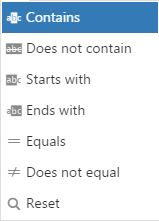
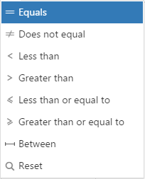
Filter Records
You can filter records by any field value.
Apply these filter operations for text and enumerated fields:
Apply these filter operations for date and numeric fields:
Limitations
By comparison with Grid Control 2.0, Grid Control 3.0 has these limitations:
- Requires JavaScript coding: you cannot define grids in pure AXVW format.
- Does not support Grid Control 2.0's grid index.
- Does not support data export to DOCX, PDF, or XLS files.