Group by Category
Grid Control 3.0
Group by Category
You can configure grid control to group records by category. These capabilities include:
- Any field in the grid data source can serve as a category field.
- Set the default grouping.
- Create a drop-down list, where users can select their preferred grouping.
The image below shows work requests grouped by category, where category equals Work Request Status, plus the value of the field: Approved, Assigned, Closed, and so on.
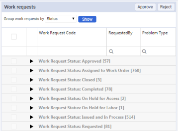
Each category header displays the number of records in that category.
If the grid displays totals for numeric fields, category headers display sub-totals for these fields in each category. For example, the grid that groups work requests by status can display:
- The total cost of work for all work requests displayed in the grid.
- The cost of work for work requests in each status.
By default, the grid expands all categories after the view is loaded. The user can collapse or expand any category.
Note:
Data sources used for grouping grids must not define their own
sortField
elements. Grid control specifies sort order based on its column configuration, and on your sort commands. Therefore it needs full control over the order of sort fields. Group by Category feature can behave incorrectly if sort order specifications in grid control and the data source are not compatible.
Add-in Manager API
To set the default grouping, enter an array for
initialGroupBy
. In the example below, the array is called
wr.status
, for Work Request Status:
var grid = View.createControl({ control: 'DataGrid', dataSource: 'projectsDataSource', pageSize: 100, groupPanel: { initialGroupBy: ['wr.status'] } });
Note:
If you do not specify the
initialGroupBy
field in the configuration, the grid displays records without grouping.
To group records correctly, specify field names within the array:
var grid = View.createControl({ control: 'DataGrid', dataSource: 'projectsDataSource', pageSize: 100, groupPanel: { initialGroupBy: ['wr.status'], groupByFields: [{ fieldName: 'wr.status', }, { fieldName: 'wr.prob_type', }, { id: 'none', fieldName: '', }] } });
To make the specified group own the data source, specify the
dataSourceName
field in the list of allowed fields for grouping:
var grid = View.createControl({ control: 'DataGrid', dataSource: 'projectsDataSource', pageSize: 100, groupPanel: { initialGroupBy: ['wr.status'], groupByFields: [{ fieldName: 'wr.status', dataSourceName: 'statusDS' }, ... ] } });
When you perform grouping on a column such as Status, data loading is performed using data source
statusDS
. When you switch to another data group, data are loaded from the data source specified in the configuration grid.
If the field you use to group records is a virtual field, set
isVirtual
to
true
:
var grid = View.createControl({ control: 'DataGrid', dataSource: 'projectsDataSource', pageSize: 100, groupPanel: { initialGroupBy: ['wr.status'], groupByFields: [{ fieldName: 'wr.status', isVirtual: true }, ... ] } });
The table below lists fields for
groupByFields
:
|
Field Name |
Type |
Description |
|---|---|---|
| fieldName |
String |
Name of the field in the database. |
| dataSourceName |
String |
Name of the database user wants to use to load the data. |
| isVirtual |
Bool |
Virtual field in the database. |
To customize the way you group records, specify special requirements with the functions
getGroupData
and
getLoadData
:
var grid = View.createControl({ control: 'DataGrid', dataSource: 'projectsDataSource', pageSize: 100, groupPanel: { initialGroupBy: ['wr.status'], groupByFields: [{ fieldName: 'wr.status', getGroupData : function (devExpressOption) { var groupData = [{ key: '', items: [...], count: 343, summary: [...] }]; /// your code... return { groupData: groupData , totalSummary: [...] } }, getLoadData: function (devExpressOption) { var records = [...]; /// your code... return records; } }, ... ] } });
The table below lists fields for results returned by the function
getGroupData
:
|
Field Name |
Type |
Description |
|---|---|---|
| key |
String |
Identification of groups in the data. |
| items |
Array or null |
Contains items included in this group. If no items, output null. Example of an item: Ab.data.Record. |
| count |
Integer |
Count of items in the group. |
| summary |
Array |
Contains values to be displayed in the grouping row for each column. |
| totalSummary |
Array |
Contains data to be displayed in the footer of the grid for each column. |
Note:
Use both methods,
getGroupData
and
getLoadData
, only inside the grid control.
To allow users to change the default grouping, add a drop-down list with category names to a filter panel, then call the grid's
groupBy
method with the selected category's field name:
<fieldset layout="fluid"> <field id="groupBy" controlType="comboBox"> <title>Group work requests by</title> <option value="wr.status">Status</option> <option value="wr.prob_type">Problem Type</option> <option value="">None</option> </field> <action id="show" mainAction="true"> <title>Show</title> </action> </fieldset>
/** * Displays grid records grouped by specified category field. */ filterPanel_onShow: function() { var groupBy = this.filterPanel.getFieldValue('groupBy'); this._grid.groupBy(groupBy); },
Or, if you need to group records by two or more fields, use:
/** * Displays grid records grouped by specified category field. */ filterPanel_onShow: function() { var groupBy, groupBy1; this._grid.groupBy([groupBy]); },
Example view: http://localhost:8080/archibus/schema/ab-products/solutions/parts/grid/ab-ex-advanced-grid-categories.axvw