Tracking Metrics
Archibus Web Central
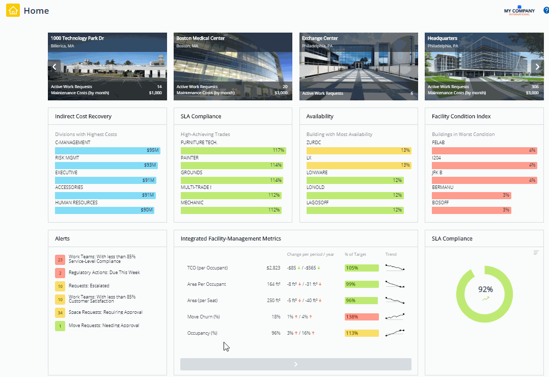
A home page can present useful information such as alerts, "top 5" issues, scorecards, and other tracking metrics. For example, the Asset Manager Home page reports on your asset inventory with statistics, alerts, and charts. These metrics provide key information right from your home page.
Metrics use the following colors to summarize your values. For each metric, the system administrator establishes the value ranges for each of the levels:
- Green - on target
- Yellow - warning
- Red - critical
Some metrics do not have any intended warning or critical value limits; an increase or decrease may not have any particular significance to the organization's strategy. In this case, the home page displays the item in blue and does not display a"% to Target" bar chart. The Indirect Cost Recovery panel, is an example.
Building Metrics Bucket
The buildingMetrics bucket is of fixed height which is a quarter-height, whch is the smallest size. Selecting any of other heights in the Home Page Editor is not going to have any effect on its actual height, but instead you will end up with a blank space per the example below:

This bucket was designed to fit 2 metrics. Although you can specify an unlimited number of metrics separated by semi-colon in the field metricName, the only first 2 metrics will be well visible. The third one will be cut through and the rest may not be visible at all. Therefore, the best practice is to use only 2 metrics for this type of bucket.
Metric - Email Notification
Your system administrator might configure Archibus so that it sends an email notification to you when your threshold levels for warnings and critical issues.
If you need details about a particular metric, click the metric name and the system presents important information about how the metric and its significance.

More Details pop-up
If you click on the colored bar for a tracking metric, the system presents a pop-up menu with selections for more details.

Then click the "by Building" option and then the Allocation and Benchmarks metrics displays in a separate tab.

Geo-coded Metrics
If a building or site has been geo-coded, you can see the location of these items on a map. From the menu, choose a "by Location" option, such as "by Site Location" and the system presents in a pop-up window a map with markers indicating the location of the sites contributing to the metric. The map markers use the same stop-light colors so that you can easily locate the on target, warning, and critical sites. You can zoom the map and hover over a marker for the site or building name.

For other metrics such as those in a scorecard, you can click on the item to launch a report or view that provides details about the data contributing to the metric or presents a console for solving the problem.