Workspace Utilization and Usage Overview
The Workspace Utilization & Usage Overview canvas shows a high-level overview of workspace utilization and usage across your organization.
To open the canvas, navigate to Analytics > Utilization & Trends and select the Utilization Overview tab at the bottom of the screen.

Use the filters at the top to show the visualizations and data by location, group, type of resource and/or workspace type, and by time frame. Learn more: Dashboard filters
Utilization information bar (A)
The utilization information bar (A) shows at a glance the utilization of resources meeting the filtered parameters and time frame:
- Peak utilization percentages: The percentages of resources in use at the peak point of utilization. The peak usage percentages are individually shown for personal space resources, meeting space resources, and all resources, meeting the filtered criteria.
- Least utilization: The percentage of resources in use at the lowest point of utilization. Includes the usage of all resources meeting the filtered criteria.
- Most utilized day: The day of the week with the highest usage on average. Includes the usage of all resources meeting the filtered criteria.
- Least utilized day: The day of the week with the lowest usage on average. Includes the usage of all resources meeting the filtered criteria.
- Most utilized location: The location with the highest usage on average. Includes the usage of all resources meeting the filtered criteria.
- Least utilized location: The location with the lowest usage on average. Includes the usage of all resources meeting the filtered criteria.
Utilization by Geography (B)
The Utilization by Geography visualization (B) indicates resource usage per country, on a map. The size of the bubble on a country reflects the utilization of resources meeting the filtered parameters and time frame. The larger the bubble, the higher the usage.
Compare usage on the map by either peak, least, or average utilization by using the buttons above the map to toggle the view.
Workspace Utilization (C)
The Workspace Utilization charts (C) show the least, peak, and average usage metrics for individual workspace types meeting the filtered parameters and time frame.
These charts are interactive with the locations displayed on the map. Select a location on the map to view the specific metrics at the location. When a location is selected, the charts show both the usage percentages for the selected location and also indicate the overall usage percentages for all locations in a lighter-colored bar. Hover over a bar to view the actual usage percentages for all locations and the specific location selected on the map.
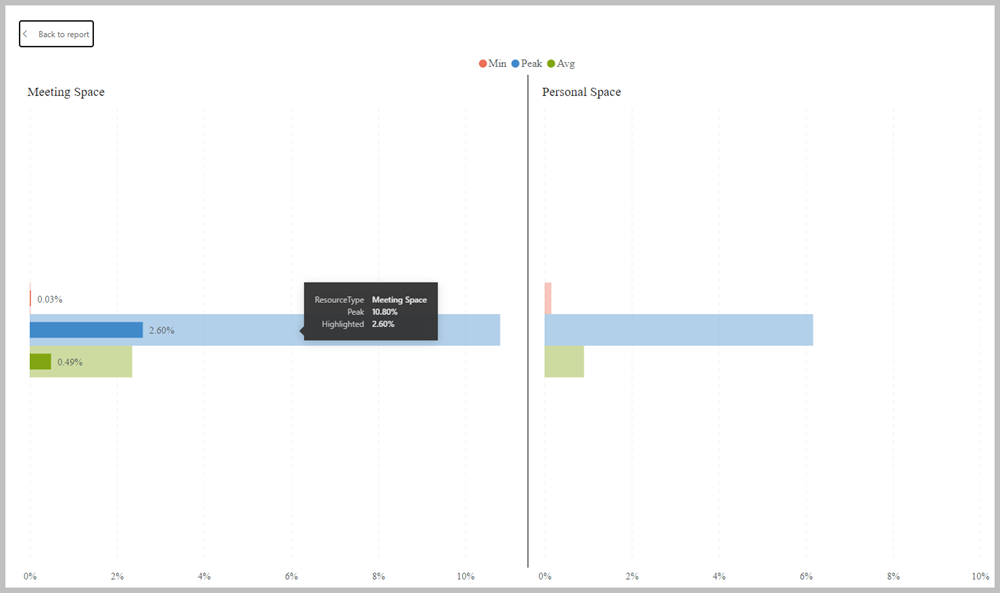
When a location is selected on the map, the usage percentages for both the selected location and the overall usage for all locations, are shown. (The chart in this example is shown in Focus mode).
No. of Meeting spaces / No. of Personal spaces (D)
The number of meeting spaces and personal spaces meeting the criteria of the location filters, excluding the Zone filter. The percentage split of meeting spaces and personal spaces is also indicated in brackets. Only resources available to book are counted.