Workspace Utilization Trends
The Workspace Utilization Trends canvas shows the overall trends of resource usage per weekday and how utilization varies week by week over a specific year.
To open the canvas, navigate to Analytics > Utilization & Trends and select the Utilization Trends tab at the bottom of the screen.

Use the filters at the top to show the visualizations and data by location, group, type of resource and/or workspace type, and by time frame. Learn more: Dashboard filters
Good to know
- No-shows and bumped bookings are excluded from the utilization calculations.
- Only the available bookable hours as per the group settings are considered.
- Deleted personal space and meeting space resources are included to ensure the accuracy of historical data.
Utilization over time metrics (A)
Select and deselect the Peak, Minimum, and Average buttons to show or hide those metrics in the charts. Note that deselecting all three buttons has no effect and results in all three metrics being displayed on the charts.
|
|
|
|
|
|

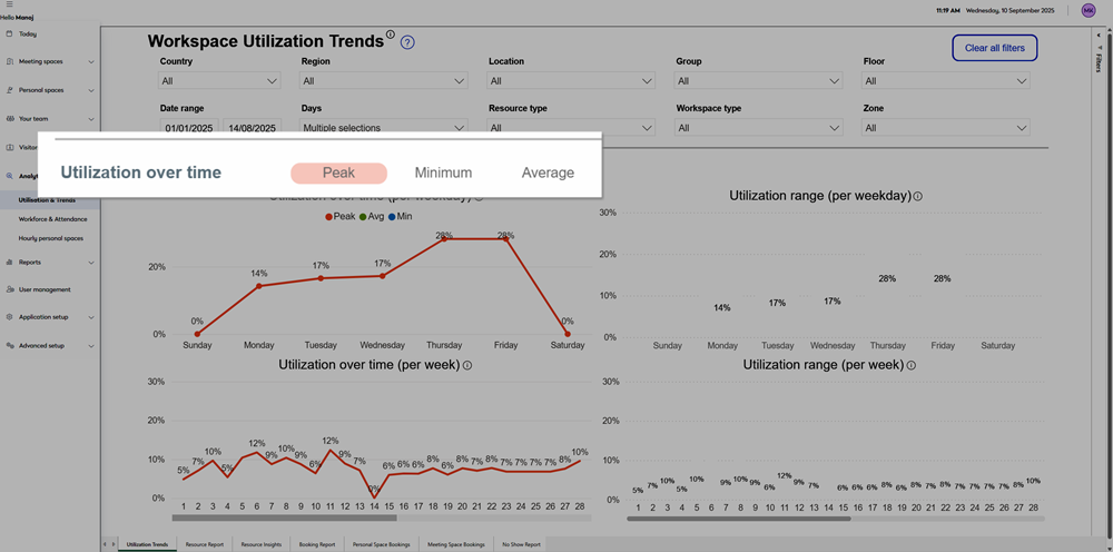


Utilization per weekday (B / C)
A line graph (B) and a bar chart (C) show the trends of overall resource usage per weekday as an overall average* for the selected time frame. Select and deselect the Peak, Minimum, and Average buttons (A) to show or hide those measures.
*For example, if a 6-month time frame is selected, the 'Monday' value on the X axis reflects the average usage across all Mondays in the defined 6-month period.
Utilization per week (D / E)
A line graph (D) and bar chart (E) show the utilization per week for the most recent year the data applies to (as per the time frame). The week numbers are based on the standard ISO week-date standard and the charts only include data for a single year. Select and deselect the Peak, Minimum, and Average buttons (A) to show or hide those measures.
Bar charts: Some metrics might not be visible on the bar charts depending on the scale. Open the chart in Focus view to view all data on the bar chart.