View Enhanced Space Utilization Analytics
From the Sensor Information screen you can view the enhanced sensor utilization analytics and how they are calculated by building, floor, and space.
Remember, your spaces types for related spaces with sensors must have their space group set to Me or We. When the space groups are set correctly, then your utilization metrics will display correctly. Learn how to change the Space Group setting in Add, Edit, or Delete Space Types.
- Click the Mode
 icon at the upper right-hand corner.
 - Change the mode to Sensor Mode.
- Select the Information tab.
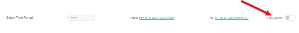
- Click the LIVE DATA OFF toggle to OFF.
- From the time period drop-down, select either 30 minutes, 1 hours, Today, Yesterday, This Week, Last Week, This Month, or Last Month. If you select Custom then you can select a From and To date and time.
- Then depending on what you select you can view the following:
- Space Calculation
- Floor Calculation
- Building Calculation
- All Buildings Calculation
- Headcount Calculation
- Headcount Floor
- Most and Least Used
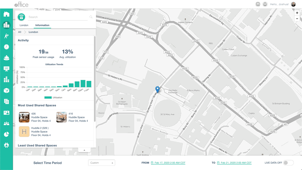
Space Calculation
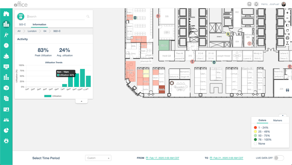
Average Utilization Calculation
- Minutes the sensor was active divided by the total center hours in the selected time
Peak Utilization Calculation
- Highest Average Utilization in a single hour in the selected time
For each calculation, multiple days are averaged together by an hour. The Utilization Trends graph is a visual of the Avg. Utilization and Peak Utilization. Peak Utilization will be a visible bar in the graph. Average Utilization will be equivalent to all the bars summed, and then divided by the number of bars.
Floor Calculation
Average Utilization Calculation
- Minutes the sensor was active divided by the total center hours in the selected time for the whole floor.
Peak Utilization Calculation
- Highest Average Utilization in a single hour in the selected time for the whole floor.
Building Calculation
Average Utilization Calculation
- Minutes the sensor was active divided by the total center hours in the selected time for the whole building.
Peak Utilization Calculation
- Highest Average Utilization in a single hour in the selected time for the whole building.
All Buildings Calculation
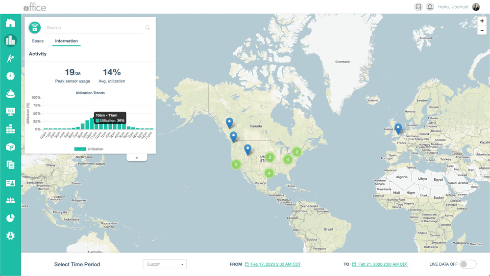
All Building Level Utilization Information tab shows the same calculations as the building level, values are calculated with sensor data from all buildings. Data is shown on a 24-hour time span, rather than center hours.
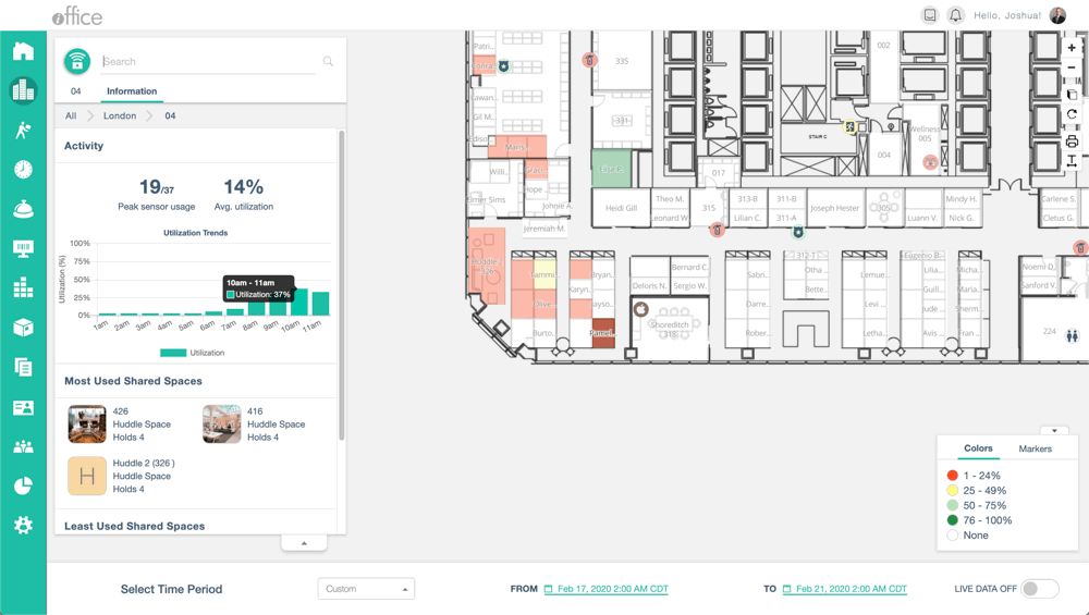
Headcount Calculation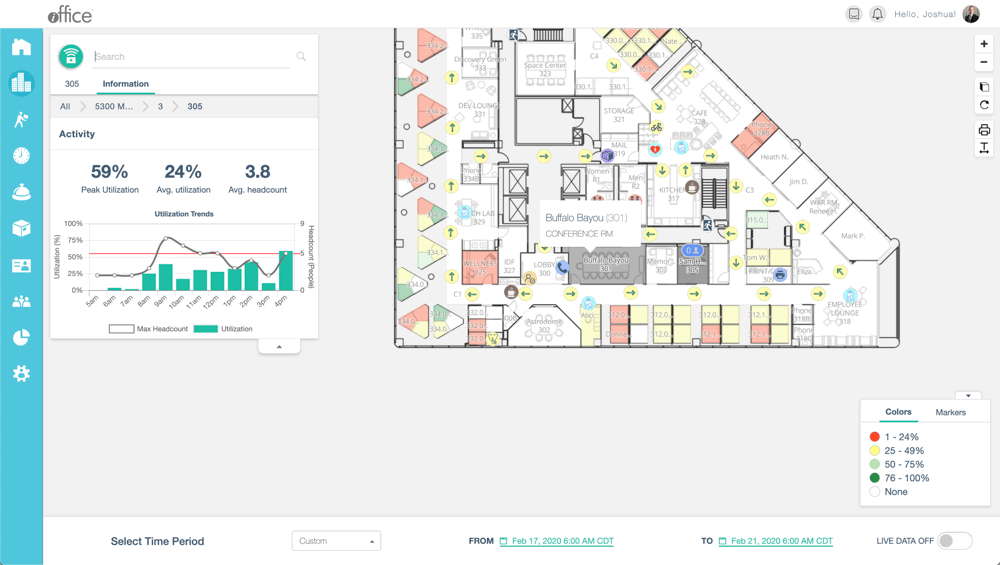
If a building, floor or room has headcount sensors, a second y-axis and an additional data point will be added to the information tab. The line graph is the simultaneous maximum headcount. This is the greatest number of people the headcount sensor counted in a single minute within the hour. Avg headcount is the average of the simultaneous maximum by the hour. The red bar is the room capacity.
Headcount Floor
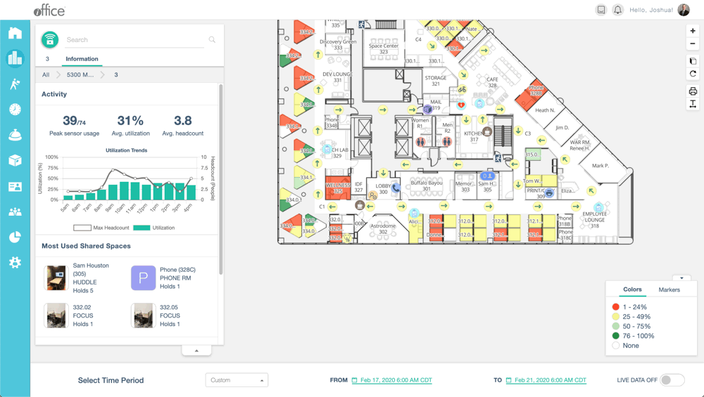
Similar to the single space, the utilization trends graph will show the simultaneous maximum headcount. All headcount values across the entire level (floor, building, etc) are totaled up by the minute, and the maximum is taken by the hour. Avg headcount is the same, an average of all simultaneous maximums.
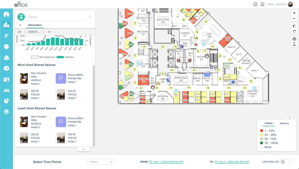
Most and Least Used
At the floor level, scrolling down the information panel reveals the:
- Most Used Shared Spaces - these are top 10 spaces.
- Least Used Shared Space - these are the bottom 10 spaces.
For floors with a small number of shared spaces, you will notice that rooms may appear in both lists as this space type is non-occupiable and has a capacity greater than 1.