Create a Dashboard
Internet Explorer users are recommended to use IE 10 or higher to avoid known issues with dashboard designer.
A dashboard provides the ability to display several reports in a single, integrated view. They may contain other dashboards, input controls for choosing the data displayed in one or more frames, and custom frames that point to URLs for other content. By combining different types of related content, you are able to create appealing, data-rich dashboards that quickly convey trends.
Access and Create a Dashboard
- Navigate to Insights > Dashboards.
- Click the Create a Dashboard button. The Create a Dashboard screen displays.
Dashboard Designer
Let's look around the Dashboard Designer, which allows you to create a dashboard that includes pre-existing elements, such as reports and views, and create new charts, tables, and crosstabs from your data sources directly from the designer.

The Dashboard Designer includes the following panels:
Available Content - From here, you can drag content onto the Dashboard Canvas. This includes the following items:
- New Content (A) - lists the control elements you can create for your dashboard.
- Existing Content (B) - Lists the Ad Hoc views and reports you can access.
- Filters (C) - Lists all filters associated with any resource added to the dashboard.
- Dashboard Settings (D) - The Dashboard Settings are located on the right-side menu. Click the Arrow icon to collapse the settings, and this can be easily expanded again.
Dashboard Canvas - This is where you create your dashboard. It includes the following sections:
- Toolbar Bar (E) - For details on the icons see the table below.
- Dashlets Area (F) - This area is where you drag items to create dashlets. The dashlets are used to build your dashboard.
The toolbar contains the following icons.
| Icon | Name | Description |
|---|---|---|
 |
Preview | Toggle between design and display modes. |
 |
Parameter Mapping | Show parameter mapping dialog |
 |
Grid Overlay | Show or hide grid overlay. |
Dashlets
Each element on your dashboard is called a Dashlet. Dashlets have unique names and resource IDs, and editable properties that vary depending on the Dashlet type.
Your permissions to access the repository may limit the content you can add.
New Content
The following new content items can be dragged into the Dashlet Area:
- Chart - Allows you to create a chart within the Dashboard Designer.
- Crosstab - Allows you to create a crosstab within the Dashboard Designer.
- Table - Allows you to create a table within the Dashboard Designer.
- Text - A free-form text entry field. Resizing this type of item changes the size of the font in the label. Use free-text items to add titles and instructional text to the dashboard.
Existing Content
The existing content is pre-built charts and tables that you can add into your dashboard. These items can be dragged to the Dashlet Area.
Filters
If a chart or table you include on the dashboard is designed to use input controls or filters, you can add that capability to the dashboard.
The server maps input controls to one or more frames. For example, if multiple reports include the same parameter, the server automatically maps the corresponding control to each of those reports when you add the input control to the dashboard. Controls can also be manually mapped to custom URL frames.
Add a New Dashlet
In this example, let's add a chart dashlet.
- From the New Content area, select the content (either Chart, Crosstab, or Table) and drag it to the dashlets area and the Select Data dialog displays.
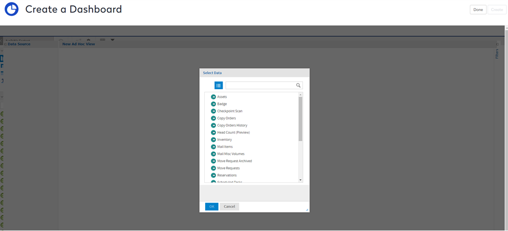
- Select the data.
- Click the Choose Data... button and Data Chooser dialog displays.

Fields
- From the Source panel, select one or multiple fields.
- Click the Arrow icon
 to more then to the Selected Fields panel.
Notes
Fields - The Add All Arrow  icon will add the all the fields.
Pre-filters - These fields can be filtered or rearranged as needed using the pre-filter and display options.
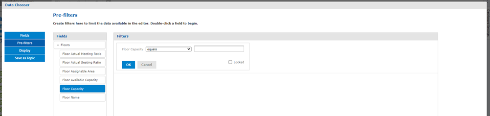
Pre-filters
- Click the Pre-filters tab.
- From the Fields panel, drag and drop the field you want to filter on to the Filters panel.
- Complete the filter condition.
- Click the OK button.
Display
- Click the Display tab.
- For the field you want to change the display name, click into the field and then change the field name.

- Select the field and use the arrows to re-sort the field.

Also, you can display the fields as a Nested List or a Flat List.
Topic
- Click the Save as Topic tab, if you want to save this topic for later use.
- In the Name field, enter a topic name.

- When you have finished with the Data Chooser, click the OK button. The New Add Hoc View displays.

The New Ad Hoc View includes the following:
- Fields (A) - Available fields that can be added to columns and groups.
- Measure (B) - Existing measures that can be added to columns and you can create a new calculated measure.
- Toolbar (C) - For details on the icons, see the table below.
- Columns and Groups (D) - These contain the fields and measures in the view.
- Filters (E) - The view's filters are located on the right-side menu. Click the Arrow icon to collapse the settings, and this can be easily expanded again.
- Format Visualization Settings (F) - The format visualization settings are located on the right-side menu. Click the Arrow icon to collapse the settings, and this can be easily expanded again.
The toolbar contains the following icons.
| Icon | Name | Description |
|---|---|---|
 |
Save | |
 |
Undo | Undo the last change. |
 |
Redo | Redo the last change. |
 |
Reset | Reset to its last saved state. |
 |
Switch Groups | Switch the groups. |
 |
Sort Order | Set the sort order. |
 |
Input Values | Change the input values. |
 |
Dashlet Properties | |
 |
Visualization Type | Set the Visualization Type. |
 |
Data drop-down |
- When you have finished adding field, measures, and filter, then click the Save icon. The Save to Dashboard dialog displays.
- In the Dashlet Name field, enter the name.
- Click the Save button.
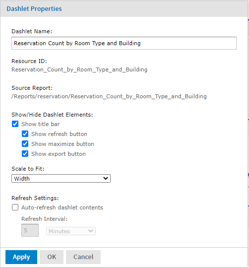
Edit Dashlet Properties
You can view and edit the appearance of and basic information for each dashlet on your dashboard, and determine the refresh settings, through the Dashlet properties. The available properties vary based on the type of dashlet you are working with.
In order to view and edit the Dashlet properties:
- Double-click on the dashlet and the Dashlet Properties dialog displays.
- Click Apply to apply and view the changes and OK to save the changes.
| Dialog | Properites |
|---|---|
 |
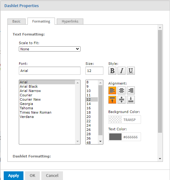
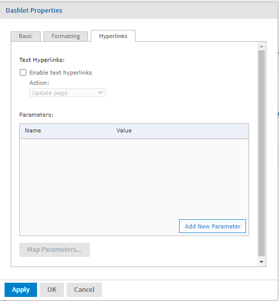
Properties for Dashlets containing charts, crosstabs, tables, reports, and ad hoc views include:
|
|
|
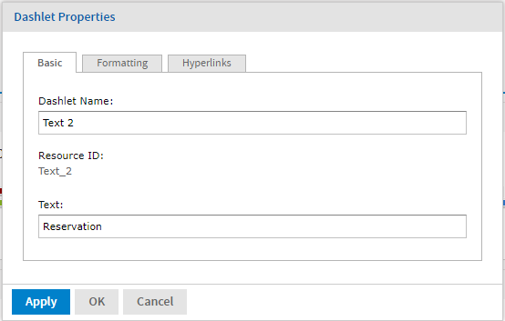
Properties for Dashlets containing text include:
|
Edit Dashboard Properties
You may view and edit the basic appearance of all dashlets on your dashboard, and determine the refresh settings, through the Dashboard Properties.
- On the dashboard toolbar, click the Dashboard Properties
 icon. The Dashboard Properties diaog displays.
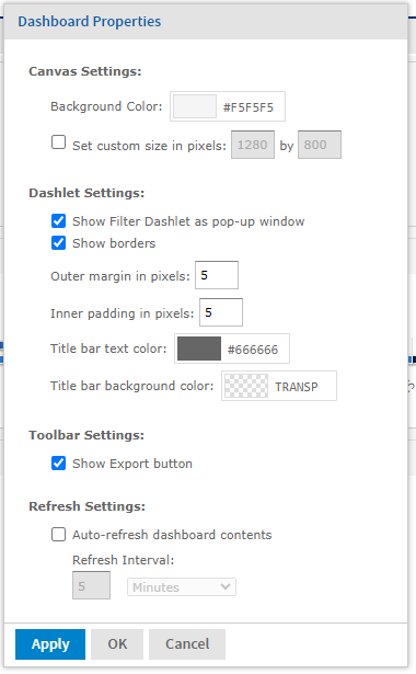
- Edit the following properties:
Cavas Settings
- Check the Set custom size in pixels check box and then enter the width and height in pixels.
Dashlet Settings
- Check the Show Filter Dashlet as pop-up window check box to display the filter dashlet in a pop-up window.
- Check the Show borders check box to show the thin lines around each dashlet.
- In the Outer margin in pixels field, enter the pixels of the margins between dashlets.
- In the Inner padding in pixels field, enter the pixels of the padding inside each dashlet.
- Click the Title bar text color picker and select the color.
- Click the Title bar background color picker and select the color.
Toolbar Settings
- Click the Show Export button check box to display the Export button on the dashboard.
Refresh Settings
- Check the Auto-refresh dashboard contents check box to enable the automatic refresh for your content and then in the Refresh Interval field, enter the number and from the drop-down select either seconds or minutes between each data refresh.