Dashboards
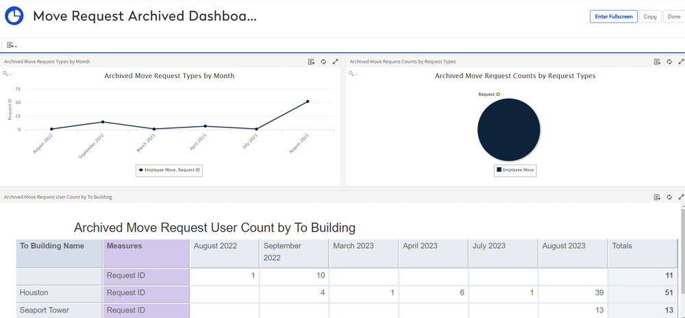
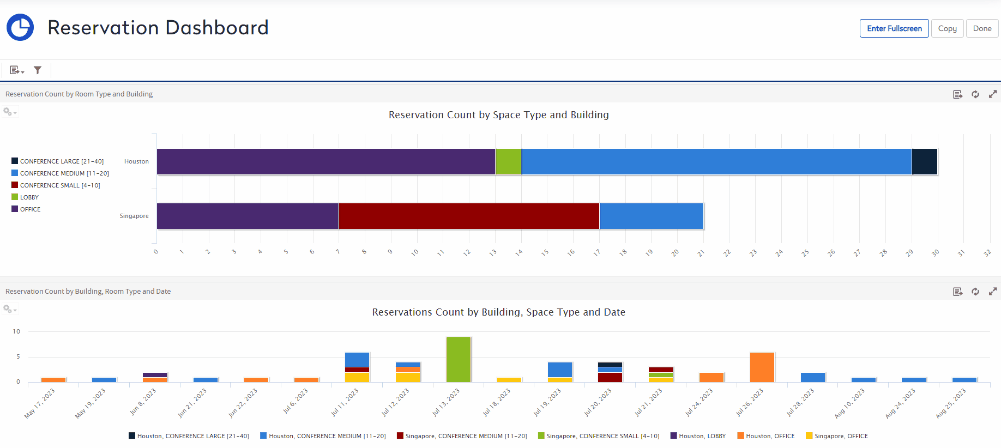
Dashboards allows you to access a wide variety of default dashboards for all modules.
- You can either search for a dashboard or navigate the list to the dashboards.

- Click the dashboard you want to display.
After you have chosen rows and columns and selected the type of chart you want, you can further explore your data:
Zoom In and Out
Zoom in to view a smaller area of the chart more closely.
- Drag your cursor over the chart to zoom in.

Click Reset Zoom button at the upper right of the chart.
Hide or Show Data
Use the legend below the chart to hide or show data.
- Hide - Click the data name and the data is hidden and the legend is grayed out.
- Show - Click the grayed data name and the data is shown in the chart.
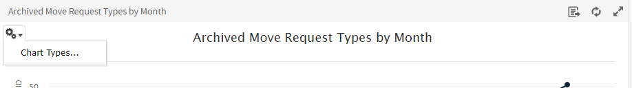
Change the Chart Type
There are a lot of chart types to choose from to best represent your information, including:
- Column: compares values displayed as columns.
- Bar: compares values displayed as bars.
- Line: compares values displayed as points connected by lines.
- Area: compares values displayed as shaded areas.
- Pie: compares values displayed as slices of a circular graph.
- Spider: compares three or more values on a series of spokes. Spider charts can use columns, lines, or areas to display values.
- Dual- and Multi-Axis: display values using two or more measures.
- Time Series: compares time intervals displayed as points connected by lines. The Time Series chart type is only available for non-OLAP charts.
- Scatter: compares values as individual points arrayed across both axes of a chart.
- Bubble: compares three measures displayed as circles of varying sizes arrayed across both axes of a chart.
- Pie: compares values displayed as slices of a circular graph.
- Range: displays values as heat and tree maps. Only the Heat Map chart is available for OLAP data sources.
You can change the default chart type.
- From the tile, click the Chart Options
 icon.
icon. - Click the Chart Types.
The Select Chart Type dialog displays.
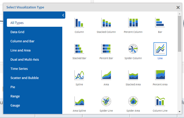
- Click the chart type you want to apply. The tile is updated.
- Click the X to close the dialog.